
About our articles and guides
In our work on 80+ games with 35+ game teams, there are some challenges that we encounter again and again. Over time, our experiences naturally evolve into generalizable best-practices.
In my articles, I strive to document these best-practices and make them available to everyone!, not just the few core clients that we serve.
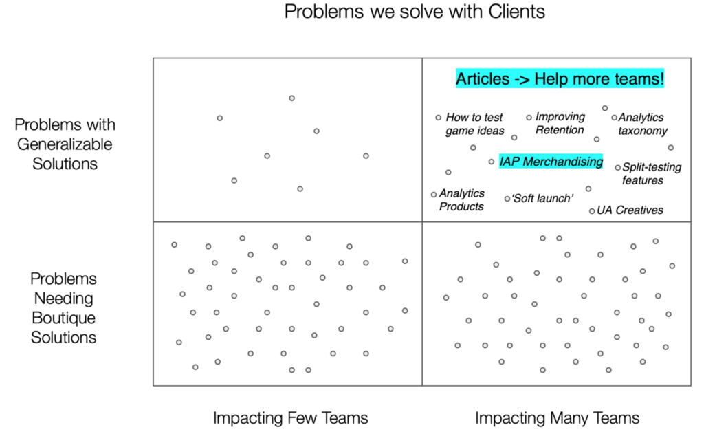
About this article
In THIS article series I will focus on IAP Merchandising, an area where best-practices are particularly tangible, well-established, and almost certain to get you the best results!
And yet, these best-practices don’t seem to be documented anywhere… let’s fix that.
If the term ‘IAP Merchandising’ is unfamiliar to you, I’d recommend you first skim: ‘What is IAP Merchandising?’
If you follow the recommendations that follow, your team can save time and effort while avoiding the most common mistakes. Perhaps, like us at Turbine Games Consulting, you’ll even come to regard IAP Merchandising, and IAP Monetization more broadly, as one of the ‘easier’ parts of F2P game development.
Now, I certainly don’t mean to suggest that effective merchandising requires NO effort. Art assets still need to be created, stores wireframed, products designed, discounts tested and so on. But if we follow a playbook, effort and results are fairly predictable, with few surprises along the way!
Why start this series with Special Offers?
Opening our IAP Merchandising discussion with Special Offers helps us focus first on the fundamentals: how to most effectively present a single product to your players. Later in this article series, we’ll zoom out and tackle broader, structural topics like store layout, segmentation and discounts.
Let’s get started!
Best Practice #1
Special Offers should be ‘Captivating’Offers have one job
If we expect our players to exchange real money for virtual (read: NOT REAL) products, we’d better do everything we can to make them look and feel valuable!
In your battle to captivate players via IAP merchandising, special offers are the most powerful tool in your arsenal. While your vanilla, in-store base products must also convey value, special offers have a higher calling: to be irresistable. The most effective offers evoke palpable feelings of excitement, opportunity, urgency and loss-aversion.
Many games miss the mark here.
When they do, a common cause is the developers’ failure to internalize and match the standard of quality set by their top-grossing competitors. The most egregious merchandising I’ve seen came from teams who didn’t habitually analyze top-grossing games.
This is an unnecessarily risky choice, because players’ perception of value is the primary driver of their monetization decisions, and this perception is regulated by the games they play most often.
So, your IAP products need to look as appealing as your top competitors’.
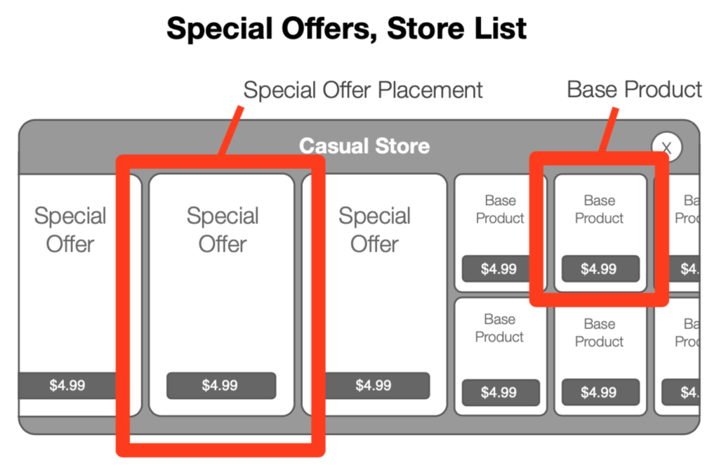
Two Types of Special Offers
The two most common places (“placements”) where special offers are sold, are:
- In-Store Product List
- Modal Popup Banner
In-Store Product List Offers
The In-Store Product List presents special offers next to basic products, facilitating the side-by-side comparisons that drive urgency.
Modal Popup Offers
The Modal Popup (or ‘screen takeover’) is the second place where special offers are merchandised.
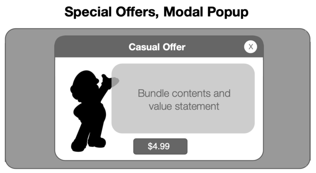
A modal popup puts the interface into a ‘mode’ where the main window, while still visible in the background, has its functionality and buttons temporarily disabled. The popup becomes the front window and has the focus.
In F2P Games, modal popups generally occupy two-thirds of the screen. This provides enough room to make a captivating pitch for your IAP product while still leaving some background visible for context.
Your Checklist for Creating ‘Captivating’ Special Offers
“Your IAP products need to look as appealing as your top competitors”.
This gets us in the ballpark but, as a measurable standard, it still falls short for two reasons:
- ‘As appealing as’ is still uncomfortably subjective
- We should aim for better than ‘appealing!’ I’d say: ‘captivating.’
So, we’ll enumerate 7 key criteria for ‘Captivating’ Special Offers.
Here is your checklist:
Mandatory:
- Generous size: To effectively communicate that they are special, special offers need significant screen real-estate. For modal pop-ups, use at least 2/3 of the screen. In the scrollable store, use ‘medium banner’ or larger size.
- Killer Hero Image: A special offer product should have a large, beautiful key art asset that makes the offer feel exciting and aspirational. This is often dubbed the ‘Hero Image’ (meaning ‘important image’, not ‘image of a hero’).
- Retina-quality art assets: Do NOT over-compress your offer assets. They should appear fully retina resolution, with crisp edges, and no visible distortion.
- Uncluttered: Having too much text, too many distinct visual elements, or inadequate margins creates visual clutter that detracts from both the clarity of your pitch and the perception of product value. This is a big personal pet peeve of mine!
- Effective Visual Hierarchy: The user should consume information in the correct order, most important to least, to minimize friction and effort. For most offers this means allowing the product title, purchase button, and hero image to carry the show, while making other elements smaller in size and lower in contrast. We’ll explore Visual Hierarchy in-depth in the next article!
Optional Bonus:
- Bonus: Clear Value Statement (where appropriate): Explain to the player, succinctly, why they should care about this offer. Provide benefits, e.g. ‘get ahead of the competition!’ as opposed to features, e.g ‘get x of this, y of that.’ While I consider this mandatory for certain offers, particularly those targeting new users, it is optional for offers that target experienced users, or offers in very simple casual economies.
- Bonus: Animated elements: Animated sparkles, glows, and other vfx are a nice finishing touch, and a clear visual marker that helps further distinguish special offers from base products.
Now that we’ve provided the checklist, let’s apply it to some actual offers!
First, an example of what NOT to do.
Don’t do this!
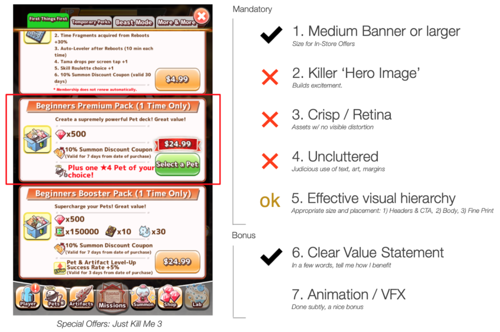
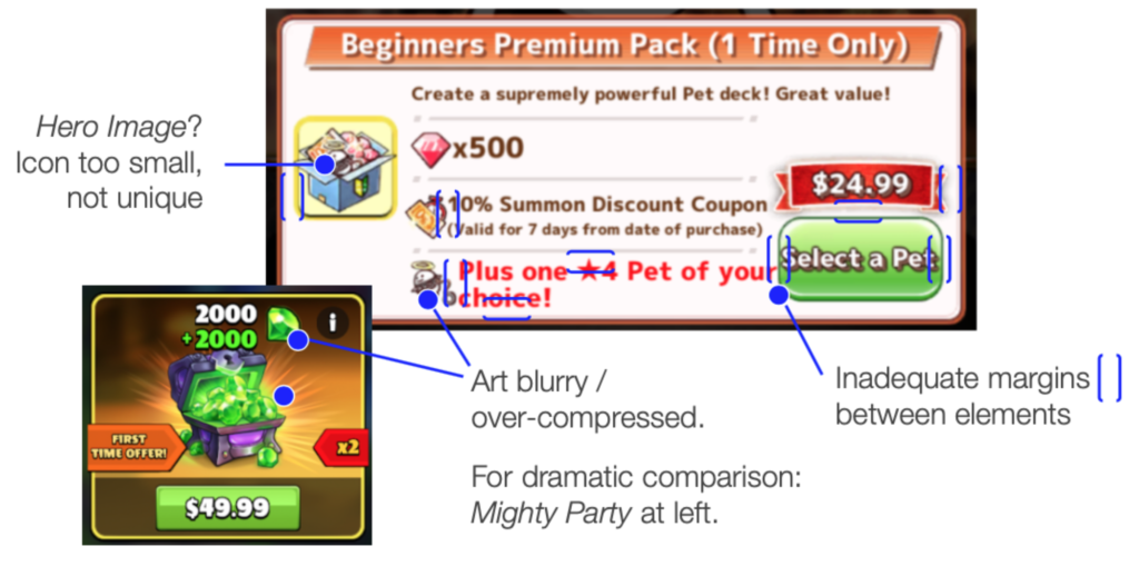
- Generous Size: ✓ ‘Medium Banner’ or larger: Just Kill Me uses banners of adequate size, but doesn’t allocate space effectively within them (see #4).
- Killer Hero Image: X The unremarkably small icon serving as hero image fails to generate excitement.
- Crisp, Retina-quality art assets: X All art assets look overly compressed, with a lack of crispness and clarity.
- Uncluttered: X All three offers in Just Kill Me 3 are too busy. The offer shown above has 37 words, 6 different text treatments (fonts, sizes, colors), and inadequate margins (space between elements). The overall effect is a sloppy look that detracts from perceived value.
- Effective Visual Hierarchy: OK Despite the clutter, the offer does a reasonable job of emphasizing the title and purchase button.
- Bonus: Clear Value Statement (where appropriate): ✓ The three offers in Just Kill Me 3 are complex and different enough to warrant short value statements, particularly since they are aimed at beginners. ‘Create a supremely powerful Pet deck!’ is a clear and concise one, provided that you can find it amongst the clutter. ‘Great value!’ would ideally be communicated elsewhere via a specific bonus or discount amount.
- Bonus: Animated elements: X None used.
Do this!
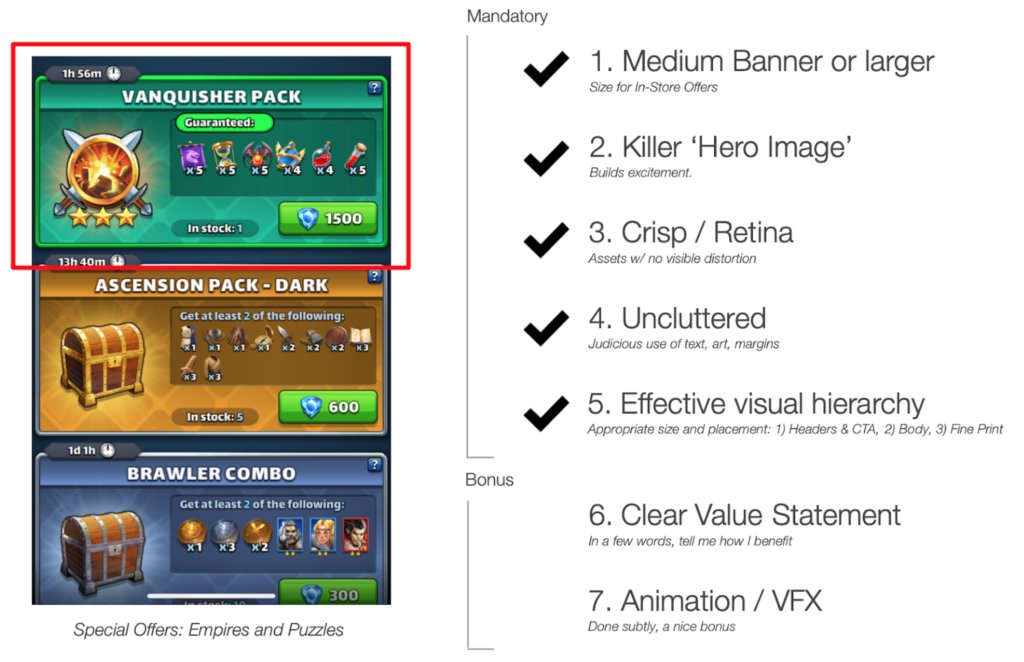
Above: The top offer (“Vanquisher Pack”) meets all five mandatory criteria in our list. Art is crisp, text is minimal, margins adequate, and layout cleanly emphasizes the title, aspirational hero image, and purchase button. Additional info is available via the small question-mark button.
The other two offers (“Ascension” and “Brawler”) fall a bit short due to their less-aspirational hero images, but this is likely part of an intentional effort to highlight the first offer.
Don’t do this!
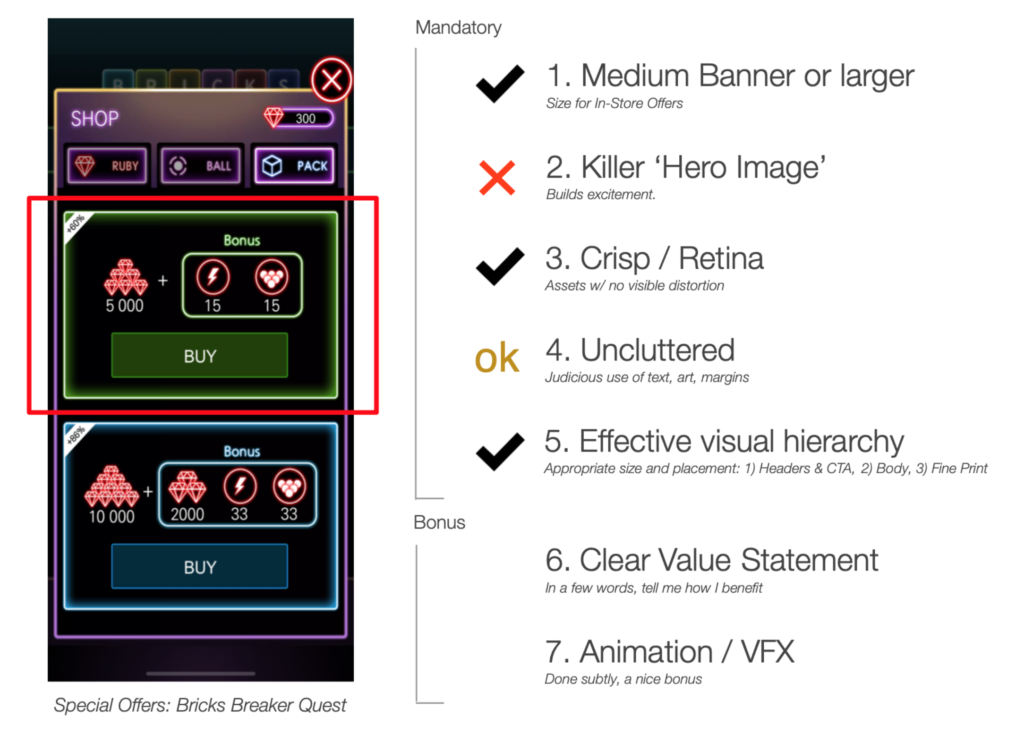
The above offers, from Bricks Breaker Quest, are another illustration of how offers without hero images can fall flat. Even if I want the items being offered (in either pack), the offer presentations aren’t making any effort to add or communicate value, interest or excitement.
To me, the offers say: “Hey you could buy this stuff, if you really want to, I guess.”
Additionally, (if I’m being picky) the containers for the ‘Bonus’ items in each offer are too small, leaving insufficient margin around their contents, and the decision to hide the purchase prices makes it difficult to compare the offers.
Do this!
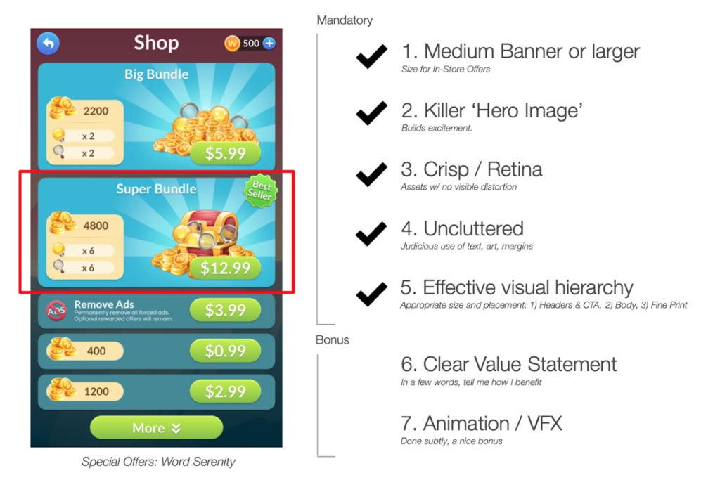
- Generous Size: ✓ The two offers use the standard ‘medium banner’ size for in-store special offers. The size difference clearly differentiates the offers from the three basic products below.
- Killer Hero Image: ✓ These large, lustrous hero images are the critical ingredient that takes these offers from unremarkable to aspirational!
- Crisp, Retina-quality art assets: ✓ Hero images and other assets are crisp and don’t suffer from any visible compression or distortion.
- Uncluttered: ✓ Word count is low (8), distinct visual elements are few (11 by my count), margins are adequate, and there is plenty of negative (empty) space, making it easy to quickly digest the offer.
- Effective Visual Hierarchy: ✓ The glorious hero image(s), purchase button, and offer title are the largest and highest-contrast elements, and thus draw the eye first. Supporting messages, including the resource quantities, icons, and ‘best seller’ badge are deliberately de-emphasized via smaller size.
- Bonus: Clear Value Statement (where appropriate): N/A Not necessary here, as the special offers’ contents are very similar, save for differences in price and volume.
- Bonus: Animated elements: X. Not present, but would have been a nice touch.
—
Key takeaways
Special Offers need to look valuable enough to generate excitement. This isn’t the time or place to skimp on art, layout or overall visual polish. Aim for captivating and don’t settle for less.
As we’ve shown above, top-grossing games have established a clear structure for building captivating offers. Let’s benefit from their R&D efforts!
By sticking to the checklist, you can maximize the effectiveness of your special offers while minimizing effort and uncertainty.
—
In the next article in this series, The IAP Merchandising Playbook, Part 2: Visual Hierarchy, we’ build on these fundamentals with a deep dive into Visual Hierarchy for Special Offers, then apply these principles to an analysis of modal pop-up offers from Casual, Midcore and Core F2P titles.
——————————————————-
If you enjoyed this article, you might also like my “How to Fail” series:
How to Fail in F2P Mobile Games, Part 1: Start without a Business Case
How to Fail in F2P Mobile Games, Part 2: Undisciplined Innovation
How to Fail in F2P Mobile Games, Part 3: Vague Product Goals
Need help with your game? Contact me!